Providing Quality Day Old Poultry Since 1988
Whether you are a commercial grower or a hobby farmer, we strive to provide you with the highest quality poultry available.
Our Poultry
Family Owned and Operated
We strive to provide customers with quality poultry as well as providing industry incite. Read how our business has evolved over the years
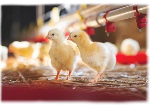
High Yield Cornish Broilers
This breed has an excellent feed conversion, livability, strong legs, and a maximum white meat yield with a plump full confirmation.
Poultry Supplements
Myers Poultry carries a full line of Poultry Supplements from Dawe's. If you are looking for added nutrition for your poultry at any age consider purchasing some of these products.
Add some color to your flock
We have colored egg layers, click the link below to view our colored egg layer breeds.